
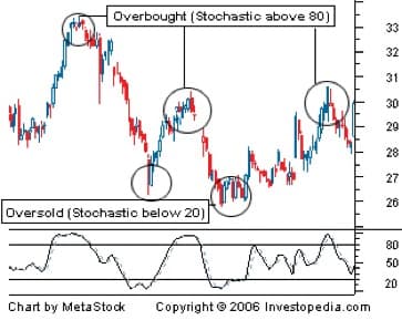
There are a number of technical indicators known as oscillators. They are all interpreted pretty much the same way. We are going to concentrate on the most popular one: stochastics. It’s worth looking at for the same reason the 50- and 200-day moving averages are worth looking at: everyone else is looking at them, too, and you want to see what other people are seeing. Among oscillators, stochastics are the ones most stock chartists are looking at.
The stochastic oscillator is interpreted as a sine-like wave fluctuating from below the 20 level, which marks oversold territory, to above the 80 band, which marks the overbought boundary. The idea behind this is that when the indicator rises above 80, the stock is overbought. (Stocks can stay overbought for long periods of time. In fact, the biggest winners will stay overbought.)
When the oscillator leaves the overbought level and crosses below the 80 threshold, this is the time to sell the stock. On the other end, the reverse is true. When the stock leaves the oversold area and crosses the 20 level, that’s the time to buy. The illustration above demonstrates this perfectly. (But buyer beware: few times in real life does it work so handily.)
Divergence—My Favorite Technical Indicator
The foregoing technical indicators are popular and, therefore, useful to understand, but I don’t really believe they have any real predictive power. Now I’m going to tell you about an indicator that actually works. This is divergence. Most oscillator indicators just track the direction of the underlying security. If a stock is rising, the oscillator will generally follow suit. When the stock falls in price, the oscillator will fall with it. Divergence is when this connection between the indicator and underlying stock is broken.
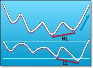
Divergence is a move in the price of an asset not confirmed by a comparable move in the applied technical indicator. For example, in the illustration, the price of HL begins a move upward, yet the indicator—LL—is actually moving in a different direction.
Divergence is the most predictive of all the indicators. However, it will be early more often than not. And early can be very painful. An often-repeated saying on Wall Street is “What’s the difference between being early and wrong?”There isn’t one.
That being said, let me show you how I interpret divergence. First of all, I only look at a version of Wilder’s Relative Strength Index when I’m examining divergence. Developed by J. Welles Wilder, the Relative Strength Index (RSI) is a momentum oscillator that measures the speed and change of price movements. Before we get too far into this, let’s rehash the popular version of what this indicator does, because I don’t use it the way most people do.
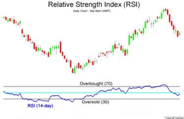
Relative Strength Index 14-period
The RSI is presented on a graph above or below the price chart. The indicator has an upper line, typically at 70, a lower line at 30, and a dashed mid-line at 50. Wilder believed that when price moves up very rapidly, at some point it is considered overbought. Likewise, when price falls very rapidly, at some point it is considered oversold. In either case, Wilder deemed a reaction or reversal imminent.
The level of the RSI is a measure of the stock’s recent trading strength. The slope of the RSI is directly proportional to the velocity of a change in the trend. The distance traveled by the RSI is proportional to the magnitude of the move. Wilder believed that tops and bottoms are indicated when RSI goes above 70 or drops below 30. Sound familiar? In between the 30 and 70 level is considered neutral, with the 50 levels a sign of no trend. According to Wilder, stocks can stay overbought or oversold for extended periods of time. (For those of you that want a formula and further explanation of how Wilder’s RSI is calculated and graphed, StockCharts.com has an excellent explanation.)
I pay no attention at all to this traditional interpretation. Oscillators generally track the movement of the stock, and if you look hard enough at any of these indicators, you can see some recurring patterns. The test is: can you accurately predict future price movements well enough to make any money? With the exception of divergence, I don’t believe you can.
What works well for me is that Wilder believed that divergence between RSI and price action is a very strong indication that a market turning point is imminent. Bearish divergence occurs when price reaches a new high but the RSI indicates a lower high, thus failing to confirm. Bullish divergence occurs when price reaches a new low but RSI indicates a higher low.
Let’s illustrate how this works with this chart of Apple. (I use Trade Station’s popular charting software and a proprietary version of Wilder’s RSI that I had coded in their programming language, Easy Language.)
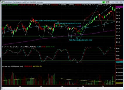
Wilder’s RSI divergence on Apple
As you can see in this screen image, Apple Computer’s stock appears to be range-bound for several months—from April, 2010, to August, 2010. Then, on August 25, and then again on August 27, my indicator fired off an alert indicating divergence. (It fired off a very early alert a month earlier that created brief profits before being reversed.) As you can see from the chart, there is a very dramatic divergence between the price action, which is still trending down or flat, and Wilder’s RSI, which is beginning to rocket up. This is a very clear bullish divergence and led to a dramatic 80-point rise in the stock before exhausting itself.
But starting around October 18th, Apple begins to show dramatic bearish divergence. This was an early warning for traders to exit or even short sell the stock—although I wouldn’t want to short a stock with such obvious strong prospects. At a minimum, Apple was dead money for a month or so after this signal.
Expanding the chart to view the price action in 2011 shows two more divergences, another bearish one and then a positive one. Actually, there are several bearish signals, but like I mentioned earlier, stocks can stay overbought or oversold a long time. In fact, strongly trending ones will.
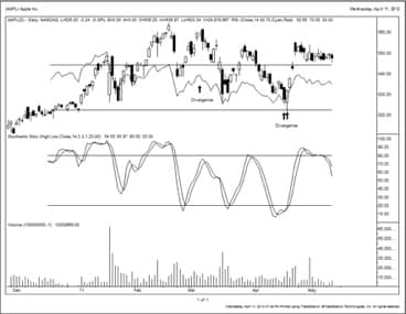
Diverging Wilder RSI line portends sell-off and rally.
As you can see, when Apple topped out on March 4th, its RSI line had already turned down. This was a classic bearish divergence. Then, for the first time, on April 15 and18, Apple showed clear bullish divergence both in the RSI line and on my indicator software. I blogged about this widely, in fact, as Apple rewarded investors with a quick 20-30 point gain depending on the entry.
A couple important points to remember:
- The period you set your indicators to will have a tremendous impact on your outcomes. I use a short time period on Wilder’s RSI indicator—just seven days. I’ve found that’s what works best for me with my style of investing. Others may find better results with different periods. Wilder himself suggested a 14-day average. I also use daily charts, but weekly charts, monthly charts, or even 2-minute charts might be useful to you, and will all likely have very different results.
- RSI divergences work best in markets that are range bound. Stocks that are breaking out or breaking down can trend in a particular direction for longer periods of time and make these types of indicators less useful.
Keep in mind, though, that technical analysis is just one piece of the picture. It’s a helpful piece—a slight edge in investing can yield enormous results. But don’t fall victim to the dogma that all known and future expectations are already revealed in the stock’s chart. As I mentioned before, one piece of news can often blow apart the most attractive of chart patterns. It’s only valuable when combined with other information. In the example below, I’ll show you how I used RSI divergence in conjunction with fundamental analysis to make outsized gains.
This example, Monsanto, was our most profitable stock trade of 2010. But we didn’t buy it only because there was a divergence in the chart. That was simply the first stage of the process. We also knew the Monsanto story.
This particular chart shows Monsanto in a range-bound pattern for a few days before the RSI rapidly moves up, on October 5, 2010. If you recall, the way these popular oscillators work is by looking at the overbought and oversold areas. But we don’t put a lot of weight in this. We use software to track hundreds of different securities, stocks, bonds, ETFs, anything that we can run a price chart on. We have software that automatically highlights divergence for us. You don’t need software to do this since most everyone has a set of eyeballs that can do it better.
Monsanto was not well-liked on the Street. Most analysts were neutral to downright bearish on the company. The stock price had been languishing for some time because of the pressure from cheaper competition for their product Roundup. We believed that this negative outlook was already reflected in the price. However, we needed a catalyst before investing. Then the CEO stepped up and bought one hundred thousand shares worth of stock ($2.2 million) between October 19 and 20, at an average price of $23.33. That was the catalyst we were looking for. The stock price action was diverging, the people that knew the company the best were buying in a big way, and the Street hated it. It doesn’t get more bullish than that. We bought stock and call options on Monsanto, and, like I said, it was the biggest winner for us in 2010.
Divergence can also be helpful in predicting major pivot points in the market at large.
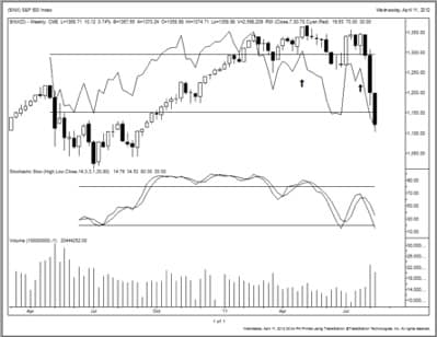
Bearish divergence in the S&P 500
The RSI on April 29, 2010, had decidedly turned lower before the S&P 500 actually broke its uptrend. This was a major bearish divergence and is very apparent in the chart above. The RSI was heading clearly down for several bars before the market finally capitulated. That gave us an early warning that there was an imminent change in the direction of the market. While divergence provides an early warning of a change in direction, it does not illustrate the magnitude of that move. There may be something to the old adage “the bigger they are the harder they fall.” In other words, the longer it takes for the divergence to be confirmed by price action, the larger the potential move.
So why does technical analysis work? Maybe you don’t even believe it does. One thing you should understand is that every major Wall Street firm employs technicians. Even if you don’t believe that it works or that charts hold any predictive value, lots of other people with lots of money do. I think everyone would agree that is good to know what the big money is doing.
Now I have some theories why this works, and they have to do with human behavior. If you’re driving along the highway, and speed limit signs are posted, you know that most people will observe and obey these signs. Charts may not be quite as explicit as a speed limit sign, but to the trained eye they are very visible limits. The charts are nothing more then a visual representation of human behavior. Much like an x-ray provides some insight into the body, the charts will provide another vantage point to the stocks you are observing. Combined with fundamental analysis, technical analysis can give you insight on when to buy and sell.
This is an excerpt from The Investment Survival Guide. Contact Michael Torrence at 435-658-1934 and ask for your free copy of The Investment Survival Guide.